Tuesday, 17 April 2012

Q4-How did you use new media technologies in the construction and research, planning and evaluation stages?


We used many different forms of technology that was all used to help with our overall outcome, for our shooting we used a HD camera and SD card which was able to get our best footage on and really worked well with the detail in our performance footage. The SD card was so that we wouldn’t lose any of our work and held all the shots that we wanted, this also made it easier for us to transfer it onto the computers. 
The MAC computers was very good to have compared to a normal standard computer due to the fact of the speed making it easy to reach deadlines and was able to use Final Cut Express with good efficiency, Final Cut was also another technology that we used to turn our footage onto the final product that we wanted. We was able to use edits such as split screens, colour correction, blurred edges to create a dream effect to the narrative, fades in and outs and layering of footage. This was able to give use the effect that we wanted to make the music video look as professional as we could. 
Another apple devices that we was using is the iphone this was so that me and my partner Emma could contact one another to arrange meetings and when we was going to film and edit also with send each other pictures that we need to upload onto blogs. This really made it easier to be organised. 
Blogger was a website that we could update all our information onto which kept us up to date with where we was in the project and showed our clear stages of our project, we used tabs to make it easy to navigate around and i have themed my wall to relate to the artist, we have shown all the research that has linked well with our music video and how we have promoted the artist and single making it easier to see the process we have gone through. 
YouTube was used through our research and uploading our final piece by having the video’s on our blog we was able to show clearly our analysis of different music videos that we have analysed. Being able to place our final out come on our blogs showed the overall result making all the research and planning show where it has all came together. 
For our ancillary task we was able to you a software called Photoshop which we was able to used to manipulate photos to create and cd cover and poster, we used effects such as layering, colour balance, text warp and a camera to take our own pictures of our singer who was lip syncing in our video. This showed a admirable cover and poster that linked well with the video which we was able to tell from our audience feedback they liked the use of our colour scheme.
Overall the technology that was supplied to us and the technology that we decided to use ourselves gave us a ending result that we wanted and hit the criteria’s that we wanted it to hit also aiming well at our target audience.        

Friday, 30 March 2012

Q3- What have you learnt from your audience feedback?

We made questionnaires and talked to the audience to receive what they thought of our overall piece. 


The audience thought about how our music video linked well with the Ed Sheeran’s style that he has established for himself, they liked the way that we had used the indie genre by placing the guitar In the music video they felt they could connect with this well as they could relate to real media products in this convention of this type of genre. 
They also liked the way that by looking at Ed Sheeran’s music videos the audience felt that we have interpreted the way that he works with the use of the connections of the guitar and the different locations that he is placed in. 
With our ancillary task we asked if they thought that it would be easily recognised by them by connecting it with the music video,  they commented by saying that we have used the locations shots from the music video onto our back cover and have produced the colours that connect them together well. 
Making most of the colour orange signifies Ed Sheeran’s colour which he established for himself as he has ginger hair. They also commented on the use of costume having the clothes that related throughout the music video we have used on the inside cover so that they would know that it was from the right song that they would have seen from the music video.


We also asked that if they thought they personally related to the narrative in the music video and many said yes they related by relationships that they have had, but some did say no but they have described that they could see that they maybe in this situation sometime in their life and they explained that it was very effective towards the audience. 
We wanted to know what they found they liked the most within the elements of the digi pac, many liked the use of the 3 way splits that we have used constantly through the piece it created a good use of energy within the narrative and especially as we used it when the music’s tempo increased building the climax to the fights that proceeded later on. 
They also like the range of locations and that we had choose them well to create a better atmosphere as all the performance location where outside and contrasted from the busy setting of Cambridge to the carming settings of the countryside this made the audience feel relaxed and felt it very easy to watch. 
 We asked if they would be able to buy the cd just by seeing the poster they commented by saying that they could definitely relate easily to the way that we have used the colours and making Ed Sheeran (BEN) as most dominate in the poster and used the colours that connected well. Some have said that they might not be able to only as he is wearing different clothing so they think they would be able to tell it is this artist but wouldn’t be able to tell that it’s the single only from the text that is written. 
We ask if they thought our whole project has connected well with the genre of music, all of them have said that they definitely think that it relates to genre as they feel that the close-up shots of the guitar and the used of different locations also the colours that we have chosen has pulled it all together and hit many of the conventions of the typical indie genre. 
The audience felt that the performance worked well as it has a good balance of both narrative and performance to engage the audience and by switching them it makes the audience want to carry on watching to see  the end of the story whilst being intrigued by the performance in between each section.     
Overall we asked what they thought of the whole project in relation to promoting the song and artist, they feel that it does and that it relates well and connects to the audience and all the advertising of the cd and poster, would make the audience want to view the music video and promoting the artist with many photos of him on the products of the cd and poster.  

Q2- How effective is the combination of your main product and ancillary texts?

Q1- In what ways does you media piece use, develop or challenge forms and conventions of a real media product ?

Thursday, 9 February 2012

More Editing

In our piece we had to add colour correction to show how our narrative had a dreamy effect on it we lightened it slightly and added a slight contrast as well.
 We also added the soft focus to get the misty glow which I feel was very effective it helped convey that it was a memory.
With the performance we wanted to add some split screens to show different parts of the guitar when it was being played especially in the instrumental parts. We also made the screen stretch out into one big shot after the three splits.

Wednesday, 8 February 2012

Editing

When we started to edit our piece we found that we did have a lot of work but we found that the effects we could use and the transitions would work well and the storyboard that we used really helped with put the whole thing into synchronisation.

Once we had all the clips into final cut express we started to edit each piece and synchronise with the music.
We used the fades to make the videos link in well with one another and had the narrative played over the top with a transparency.
we added many of these fades overlaying many of our clips to create edits with the performance mainly focusing on the way that the guitar is being played.
We layered many clips up on top of one another then resized them to fit on the screen as a split screen.


Tuesday, 24 January 2012

Our Ancillary Task


After all of our research we decided we had enough information for what we wanted to express in our text, which would hit out target audience well.
We decided to go with the colour orange as we wanted to conote the idea behind the color that Ed Sheeran has connected with his own persona as he is known for his ginger her and this is why his colour is orange.
The back cover has shown the a clear connection from the front cove, poster and inside poster which has linked through the colour theme and the aspect of nature.
The use of the logo and the production logo is to make the cd cover suggest a professional aspect from the use of adevertising what was involoved with the album which is illegal not to have on the album.
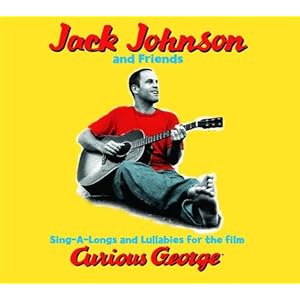
The poster i feel makes good links that the idea of having him in the same costume on each piece of the cover can link it well with the cd so that the audience is able to find the album if they went into the shops.


Monday, 23 January 2012

Matt Cardle

Matt Cardles album shows a serif text that gives the album simplicity making the audience understand what his music will include, the black and white extreem close-up picture of him gives you more about the artist himself and also connotes that he the album will have a emotional side.

Jack Johnson

I like the use of Jack Johnsons album cover by the way that he has used himself in the album and the use of using a clip from the music video to add to the album so that it is recognisable if you saw the music video.
i like the colour that he has used as this seems to be Jack Johnsons colour as he has used it in previous album covers. I feel that he does this as a lot of his songs are very happy and the acoutic notes are always in a major tone so the colour yellow represents the sunny day which it is known that everyone is happy when it is sunny.


Thursday, 19 January 2012

 James Vincent Mcmorrow new album has shown a bit of another side of a acoustic design as they have designed it with a landscape shot and used effects that added a vintage effect, the colours are very stereotypical of this genre as they tend to used a lot of sepia effects. most of the time in the music video's they use the sepia within it. As you can see from a music video from one of the songs on the album that they have used video footage that had a old fashioned filming.


The back cover and the cover on the CD has become very simple compared to the front cover the idea that they want the cover to be the main feature and as his music is very calming and the idea that the design signifies this, when you look at the serif font it starts to have a more elegant look this is what they want as the neutral colours from the front cover have just been even more suttal on the back cover.


Wednesday, 18 January 2012


We decided to dissect the new album by Ed Sheeran so that it would help us to understand all the components of the cd cover.

This is the cover that is within the case which the black and orange has a running theme through the whole cd case.
 This is what is on the other side of the inside cover this is the back cover the orange has dominate the white writing has run through the whole of the cover.
The way that the designer has laid out the song tracks is very simple which i really like as it will relate to our cd cover as we also want a simple look for our design. 


The edges on the side are what show up o the side of the cd case we will need this so that we can print it with this net so it will look right in the case. 


The bottom of the back cover shows the music producers and Ed Sheeran website that you can go to, this is important as it is legal data that must be on the case.
The front cover still has the dominate colour of orange I like the use of the artists face on the cover they have made it into a sketch which shows a artistic side to the album. 


 The inside covers also have a very simple look to them the sketches on every other page are interesting as they are pictures of the team that worked on the album and people very close to Ed Sheeran this helps the audience understand that he is a very open artist.


The last page is a thank you note by Ed Sheeran say thank you to all the people that helped with the album this helps the audience know that Ed Sheeran is a respectable artist.

The cd inside is also very  simple yet dominates in black the orange plus sign stands out signifying his logo for the album.